Core Fitness
Designing a flexible system for an active brand
Core is a fitness accessories and equipment brand tailored to those starting their wellness journey. Their previously inconsistent branding hindered their ability to convey quality and affordability. Core’s products, though diverse, lacked visual appeal, impacting their perception as a reliable option.
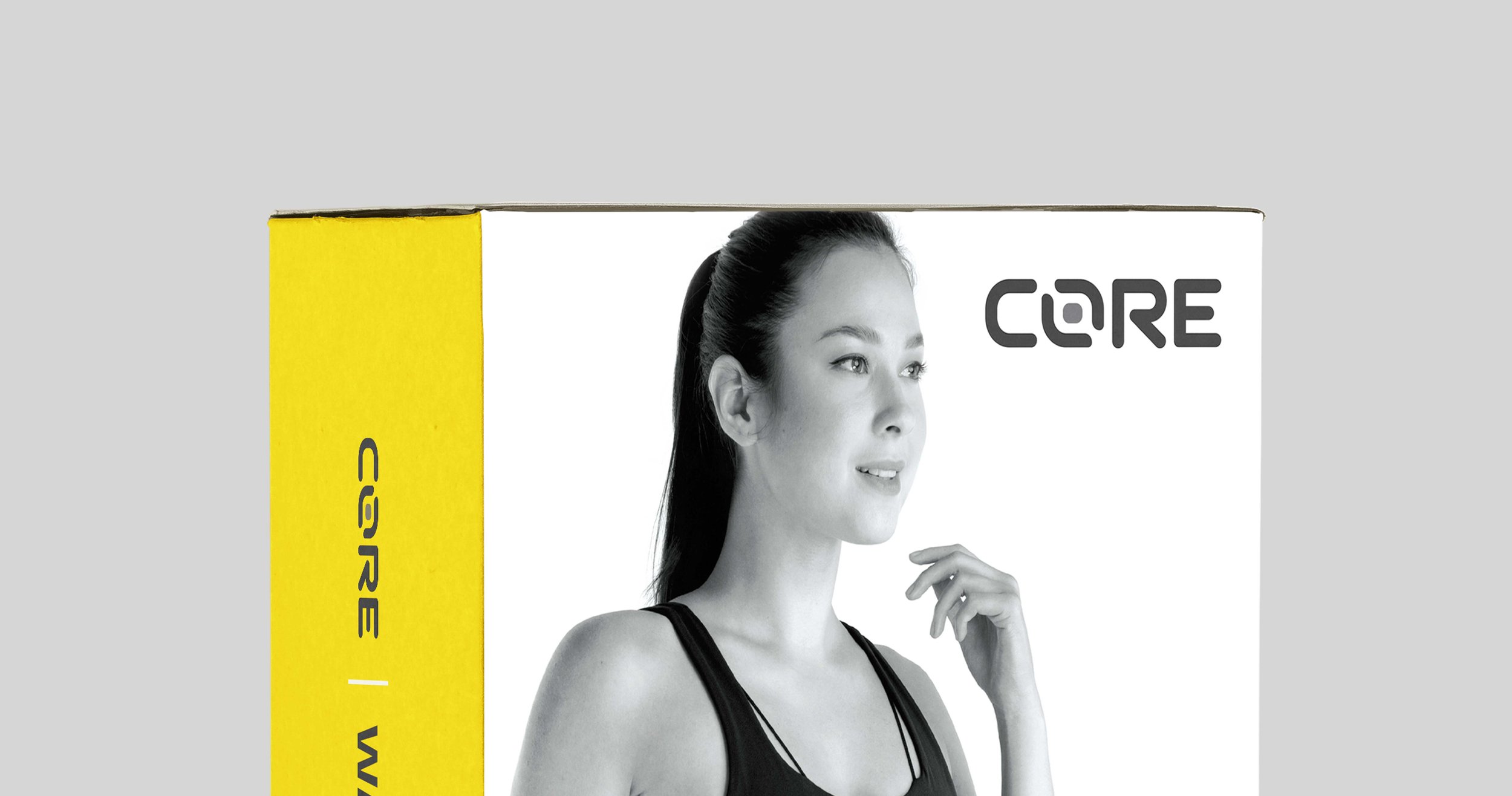
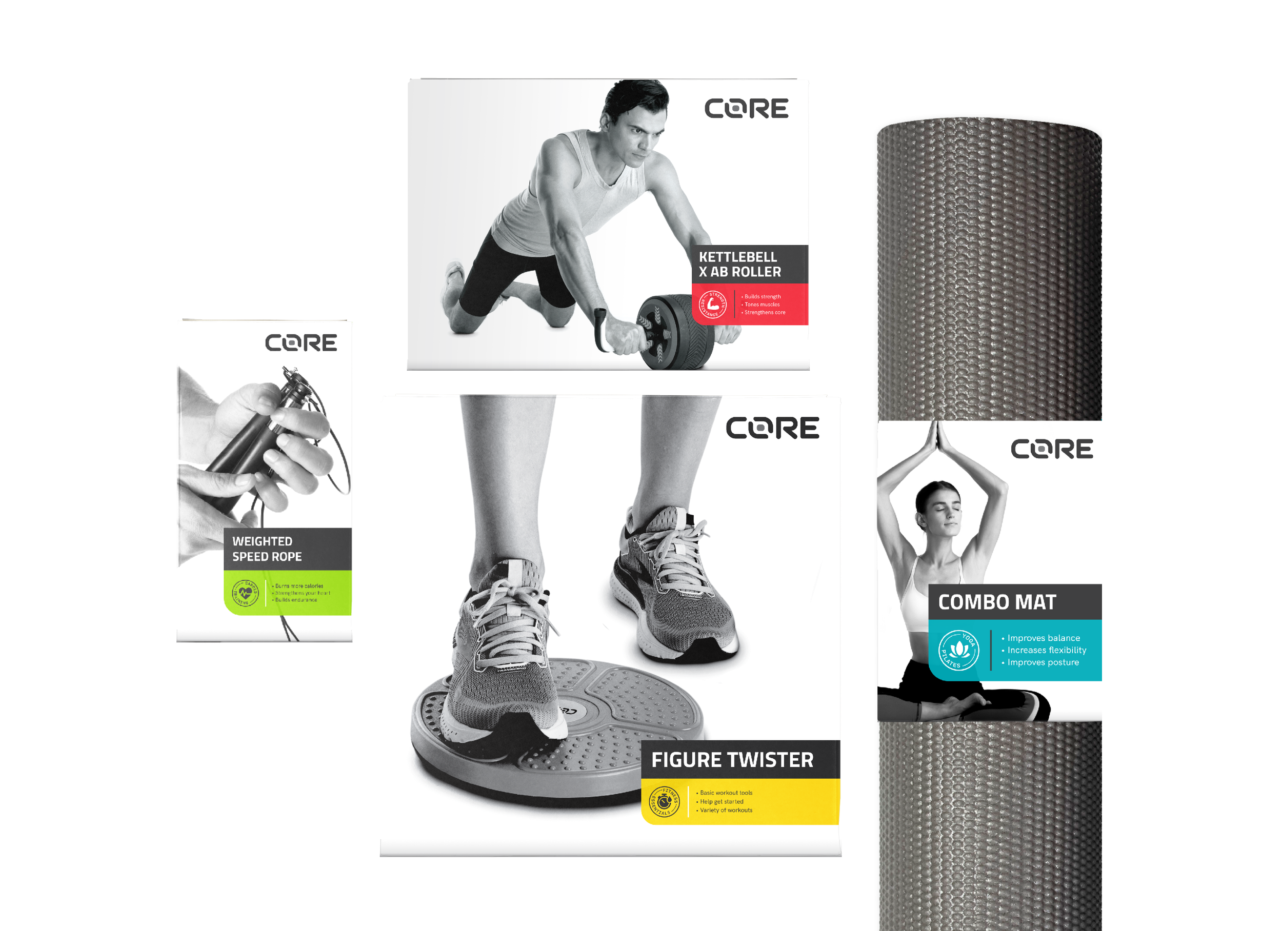
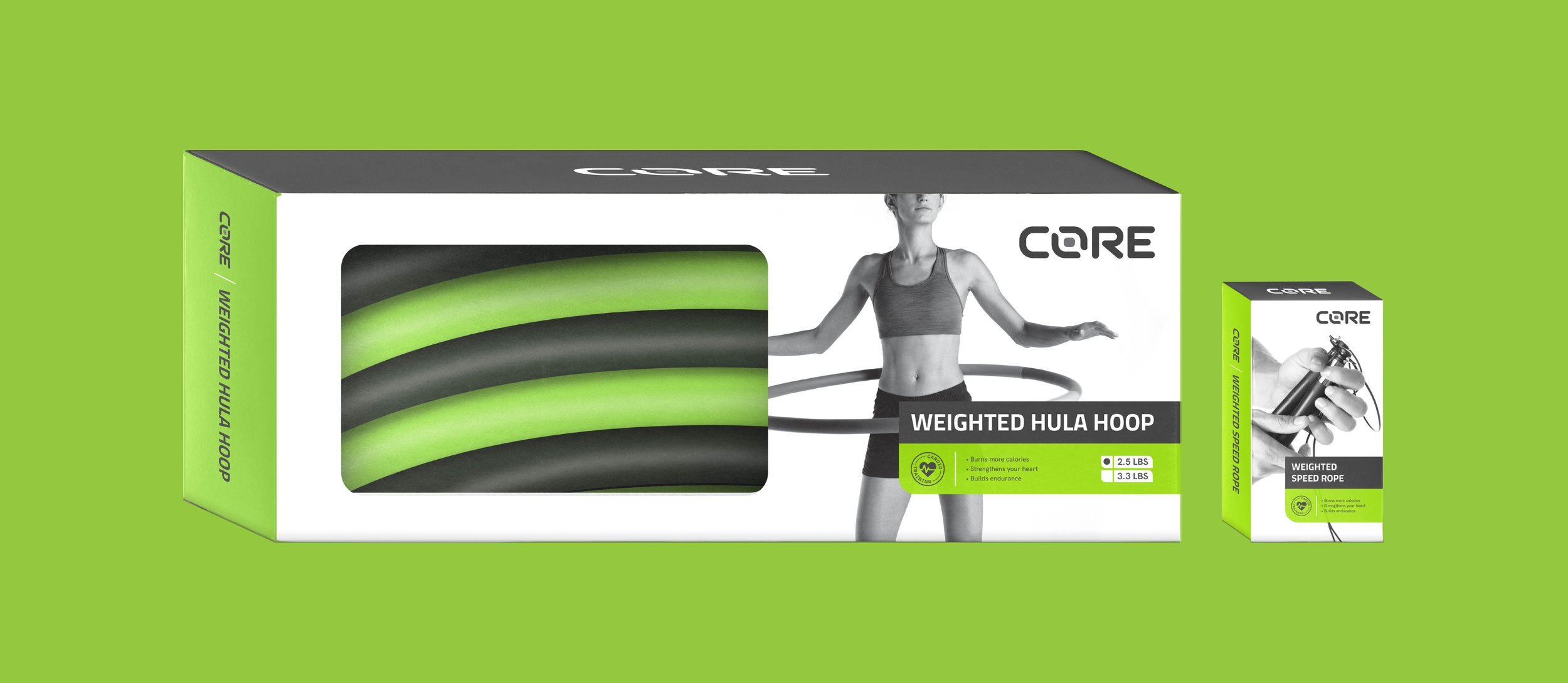
We revitalized Core’s logo and packaging system by introducing a vibrant color palette, with each product category assigned a distinctive hue for easy identification. This enhanced product appeal among beginners allowing it to pop out of the shelf and seem less intimidating than its competitors.
CATEGORY
Brand Audit, Discovery & Strategy, Branding & Identity, Brand Guidelines, Packaging Design, Iconography, Creative Direction
ROLES
Creative Director: Erin Canoy-Yarisantos
Strategy & Project Management: Cyril Yarisantos
Designer: Ivy Pangilinan
Completed at Makesaint Design

Core’s previous packaging designs felt all over the place and were not cohesive due to the inconsistent use in layout and graphic elements. The materials and cheesy photography cheapened the brand with the logo lacking uniqueness as seen in the brand audit with several other companies having a similar look.
PREVIOUS LOGO
To give it a lighter feel, the refreshed Core logo is a modern update to its original look. The softer curves provide a sense of movement and flexibility, while keeping the uppercase typeface gives it a sense of stability.
REFRESHED LOGO


The products was color-coded according to fitness categories with quick bullet points to make product selection easy for beginners. A band system was design to be flexible enough to fit any packaging shape and size.


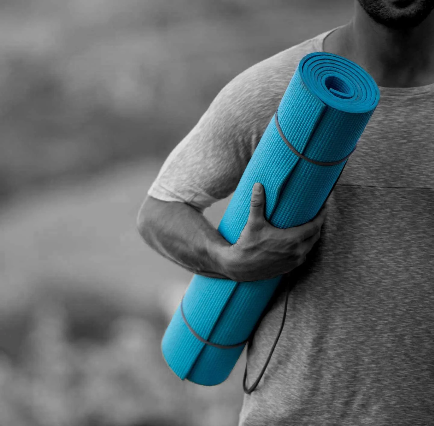
A Brand Bible with a set of packaging guidelines were provided to the in-house design team for ease of implementation in future products while the black and white photography was used as a fail-proof way of maintaining consistent imagery even with in-house photoshoots down the line.


