Trail Solutions
Building a sustainable ecosystem around the total trail experience
Trail Solutions Inc. is a professional trail building company in the Philippines forged together by an experienced group of cyclists from different disciplines. To establish their presence in the industry, the founders needed an identity that captured their professionalism as not only world-class trail builders, but as architects of a fully sustainable ecosystem — encompassing trail design, trail management, trail maintenance and repair, and community building.
CATEGORY
Brand Audit, Discovery & Strategy, Branding & Identity, Brand Guidelines
ROLES
Creative Director: Erin Canoy-Yarisantos
Strategy & Project Management: Cyril Yarisantos
Logo Animation: Paolo Nanagas
Selected Photography: Miguel Nacianceno
Completed at Makesaint Design

We conducted a Discovery Workshop with the team, and discovered that the original company’s tagline, “Design-Build-Ride,” had a disconnect between what they ultimately envisioned for the company. We learned that their services not only ended at just designing mountain bike trail systems, but Trail Solutions offered much more.
By shifting focus away from a linear outlook to a wholistic one, the circular diagram shows Trail Solution’s on-going commitment of developing trail systems that nurture the environment, sustain the local economy and involve the cycling community in its care.

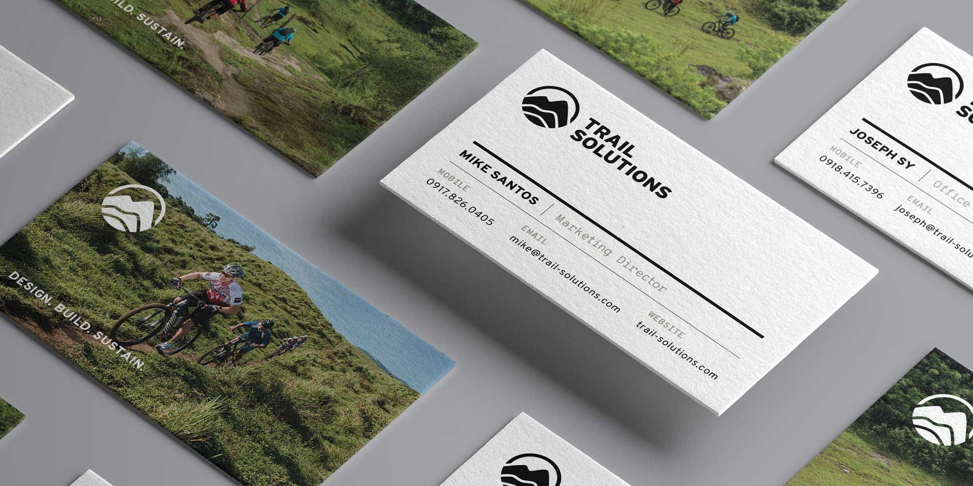
The mark reinforces the new brand pillars and their strengths. The outer circle frames the mountain range from the perspective of a lens or scope, representing the company’s expertise in surveying and mapping out the land. The mountain ranges inside not only represent the three principles of: design, build, and sustain, but they also depict the brand’s vision of outward growth towards the local community and beyond.


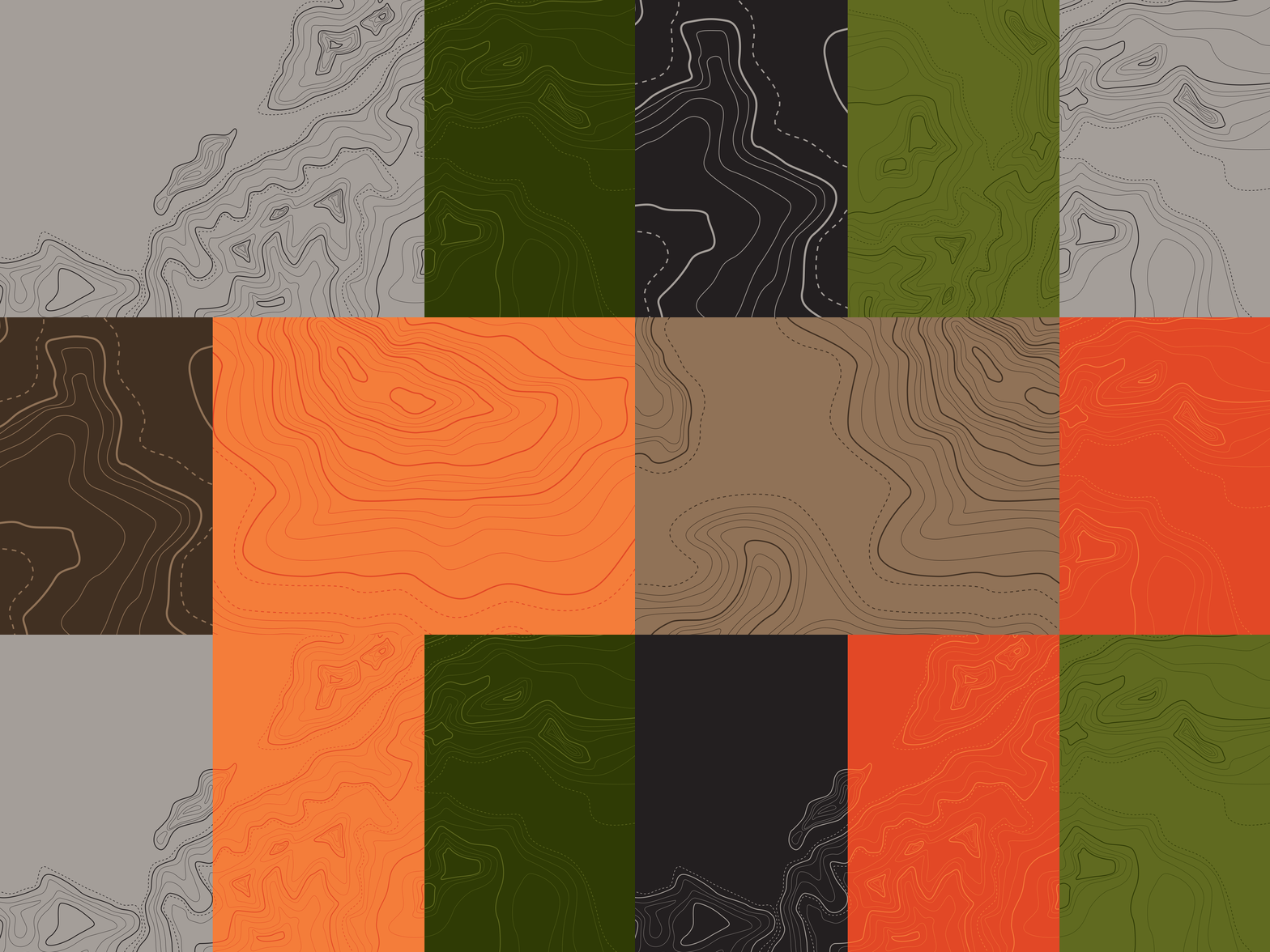
To bring the brand to life, we took inspiration from the grid and structure of engineering and architectural plans combined with the patterns and shapes in topographic maps.
Overall, the visual system blends organic elements with the rigidness of grid lines using a natural color palette inspired by land and the warmth of the tropical sun.

To ensure a consistent identity, we drafted a set of guidelines not only for the strategy developed and proper logo usage, but also a set for executing the established the visual language of the brand.


